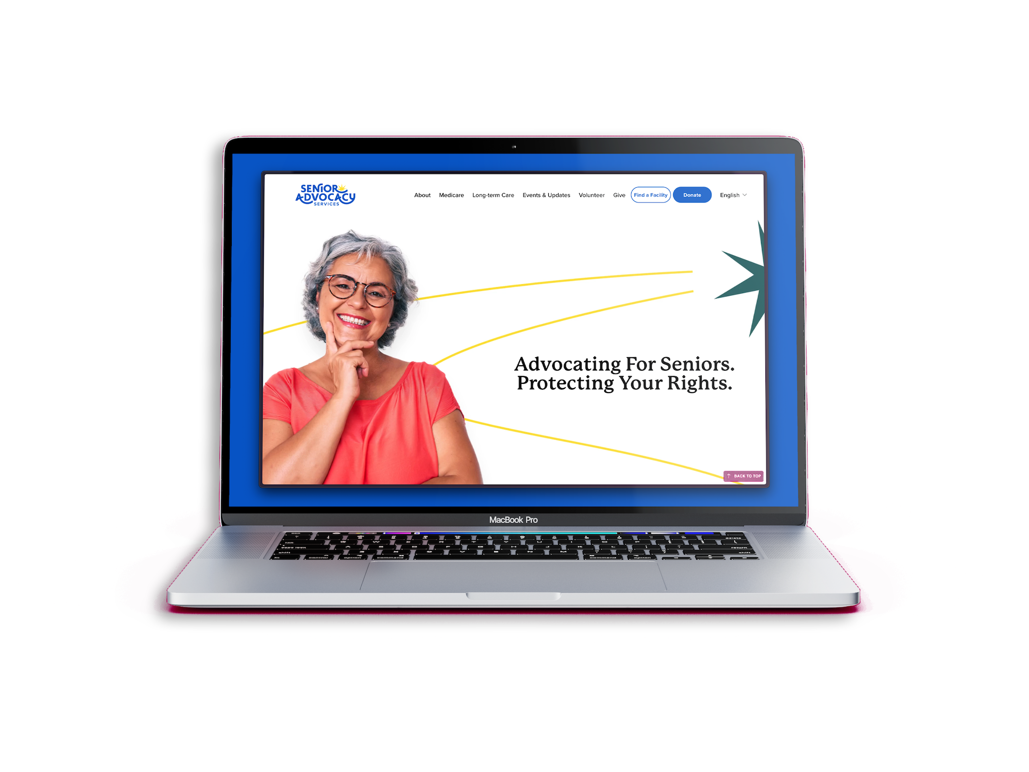
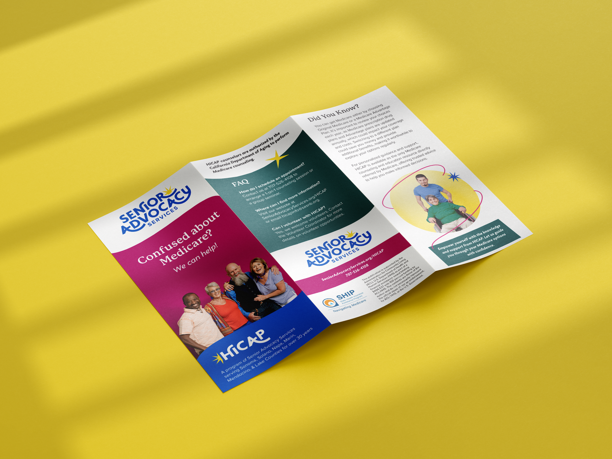
IMPACT: This rebrand delivers a clear, compassionate, and approachable identity that reflects the organization’s people-first mission while reinforcing its professionalism. A custom visual system brings warmth and structure, and the redesigned Squarespace website improves usability, accessibility, and search visibility. Streamlined program pages clarify the roles of HICAP and LTCO through a more intuitive logo hierarchy, reducing confusion and making services easier to navigate. Together, the new brand and digital experience strengthen public presence and empower more older adults to access the care and support they need.

Scope
Creative Direction & Brand Strategy messaging, hierarchy, brand guideline
Branding tiered logo system, typography, colors, illustration style
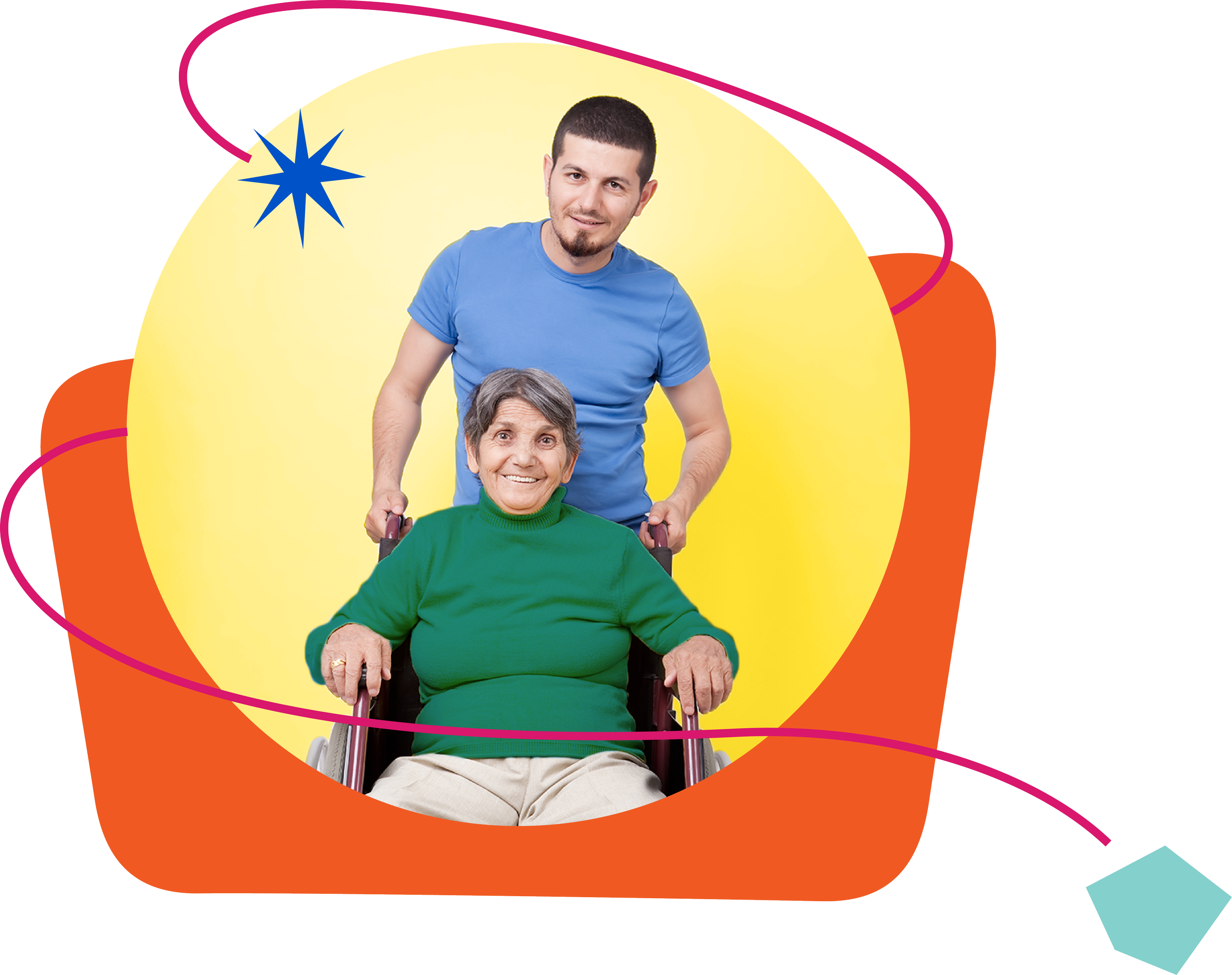
Art Direction moodboards, timeline, photography style, editing
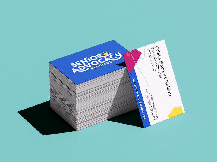
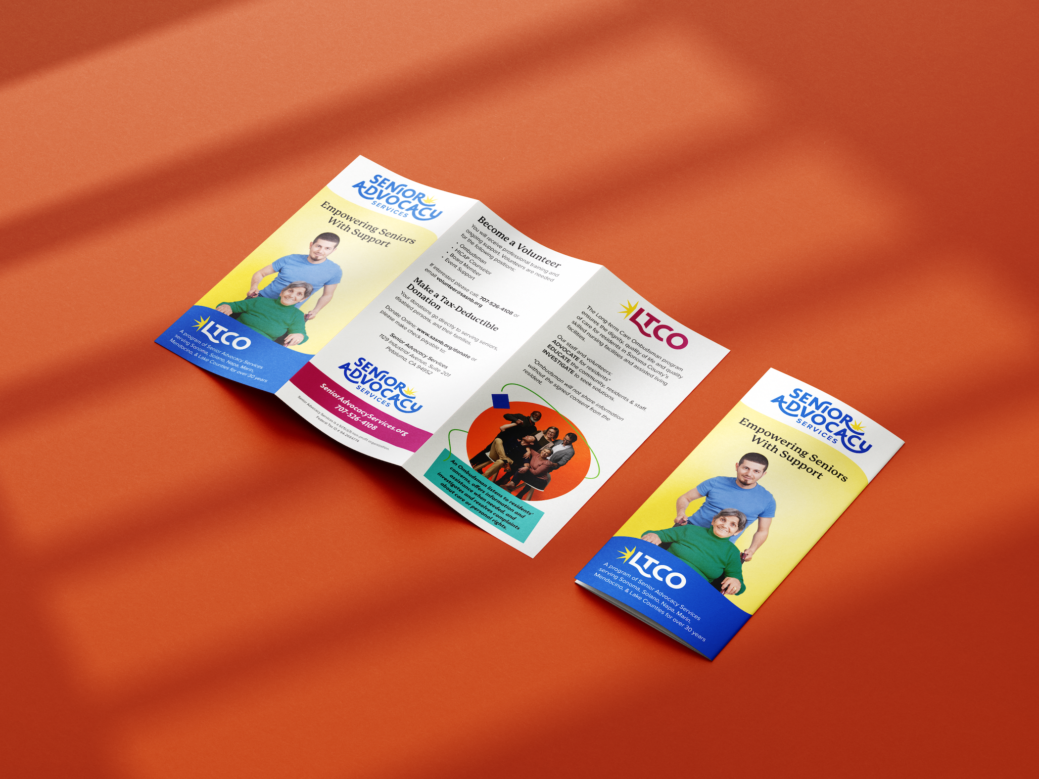
Print Materials business cards, brochures, stationary, flyers, posters
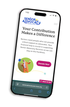
Digital Materials website, presentation decks, email